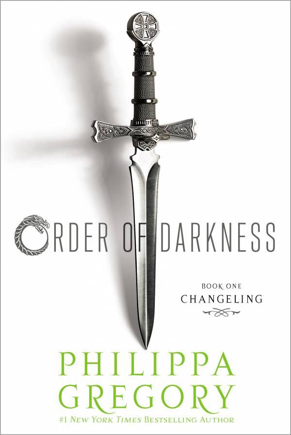
ORDER OF DARKNESS: CHANGELING
By Philippa Gregory
(Released January 1, 2013)
About the book
Dark myths, medieval secrets, intrigue, and romance populate the pages of this first in a four-book teen series from the #1 bestselling author of The Other Boleyn Girl.
The year is 1453 and all signs point to it being the end of the world. Accused of heresy and expelled from his monastery, handsome seventeen-year-old Luca Vero is recruited by a mysterious stranger to record the end of times across Europe. Commanded by sealed orders, Luca is sent to map the fears of Christendom and travel to the very frontier of good and evil.
Seventeen-year-old Isolde, a Lady Abbess, is trapped in a nunnery to prevent her from claiming her rich inheritance. As the nuns in her care are driven mad by strange visions, walking in their sleep, and showing bleeding wounds, Luca is sent to investigate and driven to accuse her.
Forced to face the greatest fears of the dark ages—witchcraft, werewolves, madness—Luca and Isolde embark on a search for truth, their own destinies, and even love as they take the unknown ways to the real historical figure who defends the boundaries of Christendom and holds the secrets of the Order of Darkness.
About the author
Philippa Gregory is the author of several internationally bestselling novels, including The Other Boleyn Girl and The White Queen, and is a recognized authority on women’s history. She lives in the north of England with her family and welcomes visitors to her website, PhilippaGregory.com. Order of Darkness: Changeling is her first novel written for teens.
Link to the official sites
Visit the Official Site
Learn more about the author
Giveaway Details
5 US winners will receive a copy of Order of Darkness: Changeling
Simply fill out the Rafflecopter form below.


I do like the first cover better mainly because it has more color. Although, this cover is simply and beautiful. I kind of like both of them alot!
I love how the light green font stands out against the white cover. Simple but powerful.
Big change. I didn’t realize it was the same book at first.
Very big change. I’m not sure…this requires a read.
I really like the other cover with people on it. This cover is simple and plain, though that’s not necessarily a bad thing – this one just doesn’t catch my eye as much as the other one.
I like it, actually prefer this than the HC cover. It’s simple but still striking.
I like this cover much more
I liked the other cover better because it was more colorful, but this one is good too. I’ve been excited about this since I first heard about it. Fingers crossed.
I this one much better! The other one just looked like any other YA book with the pretty girl in a dress and the mysterious boy behind her. This one is simple and awesome looking! 😀
I think the cover looks awesome! *u*
I love the cover!
I prefer the old hardcover’s cover because it was really pretty, and this one is dully white.
it’s simple looking
I think this new cover is gorgeous! I’ve wanted to read this book for so long. I’ve been such a huge fan of Philippa Gregory since The Other Boleyn Girl.
Love the cover, simple yet totally eye catching.
It’s really awesome!!!
It grabs you…it’s intriguing..I like it!
I like it simple, eyecatching
It’s simple, but I like it!
I love the simplicity of the cover and how realistic it is. I love Philippa Gregory!!
I love the simplicity of it yet still makes a statement.
The cover on this book is fantastic! I absolutely LOATHE corny book covers that are too busy or dripping with too much man flesh and what not. I think people underestimate the power of simplicity. This cover is intriguing just the way it is, I love it!
Simple but enticing 😉 Thanks for the awesome giveaway 🙂
think it is a eye catching cover
The cover is eye-catching in a simple kind of way and I like the little bit of green—it gives the cover a pop of color. 🙂
pretty and simple (:
I think the cover is fantastic – I love short swords and daggers. Have a very small collection myself
I think the cover is beautiful
I like this cover so much more than the original!
Great looking cover but a little to light
I actually really like this PB cover. I like that it’s simple and not stuffed with images (though I do kind of wish it had more color). I like how the sword pops off the page because of the shadow behind it, too. I have read reviews that were disappointed that there wasn’t a lot of action/adventure or paranormal elements, but I for one LOVE historical fiction and am quite used to “slower” reading, lots of details, etc. Plus I love Philippa’s adult books and am really looking forward to this one!
Very Minimalistic. I like.
It is very boring compared to her other book covers. It is just a dagger. I honestly would probably breeze right past it.
I like it
Looks very sinister.
Simple but yet captured the eyes.
I don’t really like it. It’s very plain. Much prefer the other cover